
This post was originally published on this site.
Yasmin RufoBBC News

 Pantone
For anyone who has spent years renting, staring at the same landlord-approved magnolia walls and dreaming of one day adding some actual personality to their home, Pantone’s 2026 Colour of the Year might feel like a personal attack.
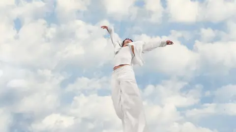
This year, Pantone has chosen white as its colour of the year.
More specifically, Cloud Dancer – a white described as “lofty” and “billowy” which “serves as a symbol of calming influence in a society rediscovering the value of quiet reflection”.
It is the first time white has been chosen as the colour of the year, and it has raised more than a few eyebrows.
According to Pantone, Cloud Dancer “is not just a colour, it’s a mindset” and reflects a collective desire to slow down, reset and find calm after years of visual overload.
 Pantone
But some critics have labelled the decision as “Pantonedeaf”, arguing that elevating minimalist and pristine white spaces can feel far removed from the smaller, messier homes most people inhabit.
Others argue that positioning white as aspirational risks racial undertones, landing uncomfortably amid ongoing political and cultural conversations about race and representation.
Clinical or calm?
Designer Chris Beaumont says the backlash goes beyond aesthetics, arguing that white carries cultural undertones and is rarely a neutral choice.
“White is a signal,” he says, shaped by a decade of minimalist celebrity interiors – most notably Kim Kardashian’s stripped-back home – that came to represent “wealth, order and distance from chaos”.
He explains that white is “not about inspiration but being careful not to offend”, with Cloud Dancer embodying “austerity, moral minimalism and the idea that neutrality signifies virtue”.
Beaumont points to the pandemic as a turning point in how people relate to their homes.
“Overnight they became our offices, sanctuaries and emotional anchors,” he says, adding that against this backdrop, pushing the Colour of the Year towards “further visual emptiness feels rather tone-deaf”.
Rather than offering calm, he believes white now risks amplifying “a sense of bleakness”, particularly when paired with cool, clinical lighting.
‘Hospital vibes’
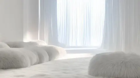
Lara Clark, a Surrey based interior designer, agrees and says Cloud Dancer “doesn’t really read as a colour” and is “firmly in the bin for me”.
While it may suit highly minimal or architectural spaces, she says bright whites rarely create calm in real homes.
“What looks serene in a styled shoot can easily feel clinical at home,” she explains.
“White can feel stark and unforgiving and you don’t want your home to give hospital vibes.”
 Lara Clark
She adds that “homes should spark joy and feel warm and lived-in, and this shade feels quite removed from that.”
Beaumont hopes that homeowners will reject the Pantone Colour of the Year in favour of “full-scale dopamine décor”, using colour to express personality.
Laurie Pressman, VP of the Pantone Colour Institute, told the BBC that people “bring different feelings” to the meaning of the colour, but it was chosen as it “works seamlessly with everything around it, offering a refined neutrality that feels intentional and adaptable”.
Since its launch in 2000, Pantone’s Colour of the Year has become a powerful industry signal.
Past choices have included the optimism of Living Coral, the calm confidence of Classic Blue, the vibrancy of Viva Magenta, and most recently softer, emotionally driven tones like Peach Fuzz.
These colours don’t just live on trend forecasts – they show up in fashion collections, beauty launches, interiors, packaging and even technology, shaping how products are marketed and how consumers imagine the year ahead.
 Carlos Avila Gonzalez/The San Francisco Chronicle via Getty Images
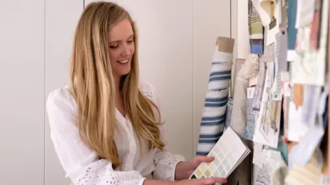
Victoria Robinson, a style and trend expert, says Cloud Dancer is a “beautiful choice” and while it may seem simple, “this particular shade feels soft and elegant rather than stark”.
In contrast to those who say the colour is boring, Robinson sees it as “adaptable” and says it’s best used in “bedrooms and living areas where you want a serene, restful atmosphere”.
“Even if you don’t want to repaint, you can introduce the colour into a room with cushions, throws and curtains.”
 Pantone
Interior designer James Mellan-Matulewicz says although he was surprised that Pantone’s pick this year was “essentially the absence of colour”, it is a bit like vanilla ice cream, in that “everyone likes it but it’s nobody’s favourite”.
He can see its merits, explaining that white can work particularly well as a backdrop for architectural details like panelling and arched doorways which is a “growing trend in modern homes”.
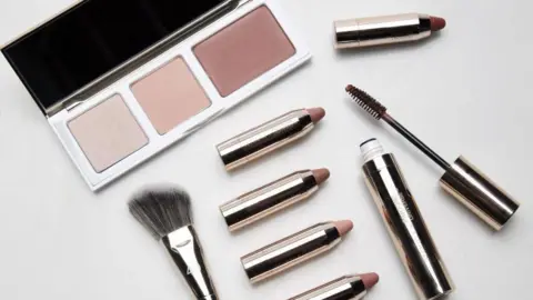
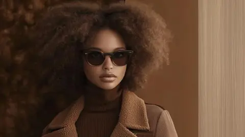
In fashion, white has long been a staple rather than a statement and as a Colour of the Year it presents a different challenge to designers more accustomed to bold shades.
Luxury stylist Oriona Robb says elevating white feels “less about novelty and more about intention”, reflecting a shift towards refinement after years of trend overloads.
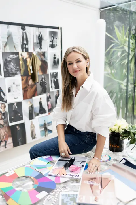 Oriona Robb
“White forces designers and wearers alike to focus on form, proportion and quality, there’s really nowhere to hide,” she explains.
But she adds that it also carries assumptions around body confidence, lifestyle and privilege, saying: “When white is treated as something only a narrow group of people can pull off, it becomes exclusionary.”
She says industry is already aware of the uncomfortable undertones tied to celebrating white as an ideal, particularly amid ongoing conversations about representation and accessibility, and the real test will be whether “brands engage with that nuance honestly, or simply aestheticise the colour”.
A cultural mood, not a trend
Stylist Katie Malik admits the choice initially surprised her, given Pantone’s history of bold colours, but says it reflects a genuine shift and fits within a wider mood of “quiet luxury”, burnout and a rejection of excess.
She says feedback from her clients has been largely positive, with many craving calmer, more restorative spaces.
“Many people are actively seeking tranquillity and serenity in their homes and aren’t always ready to commit to more daring colours,” she explains.
Whether white feels calming or sterile, Malik argues, depends on how it is used and far from being “Pantonedeaf”, she sees it as one of Pantone’s most usable picks.
Cloud Dancer is described as a blank canvas that allows “all colours to shine”, a view Malik shares.
“A blank canvas isn’t an empty space, it’s a space filled with potential,” she says.
Adding that its success “won’t be in its universal adoption, but in how it anchors a larger conversation about what we want from our homes”.
For those tempted to embrace Cloud Dancer in all its pristine glory, one thing may be essential: a very good stain remover, kept firmly within reach.


